
How To: Customize Theme Styles
Almost any theme style customizations are possible in PWA with the help of a powerful built-in code editor. Here are simple steps to change the look and feel of the theme.
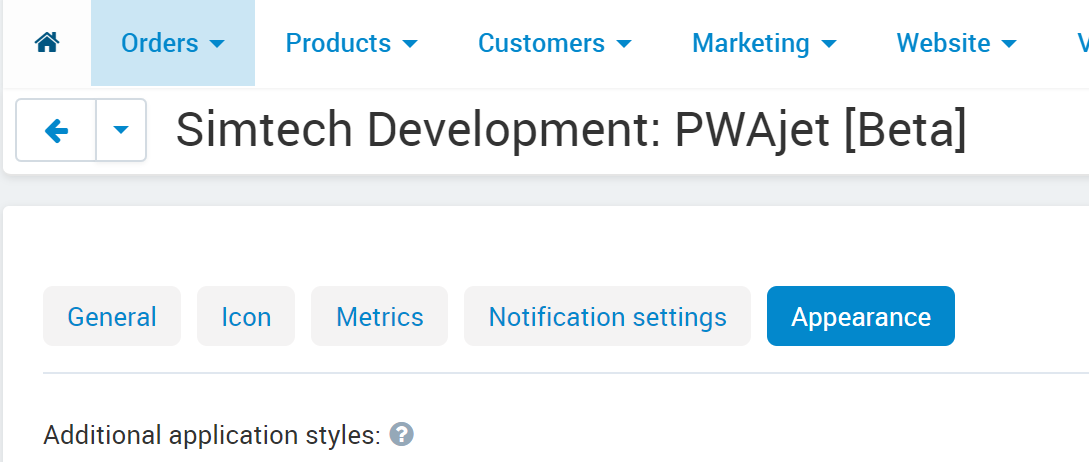
Navigate to the Appearance tab in the add-on settings.
Edit the style with a full-fledged code editor located there.
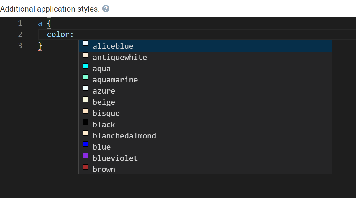
Any settings related to styles can be done directly in the editor.
For example, CSS variables are in charge of the color scheme:
--primary-color-hsl-hue: 198;
--secondary-color-hsl-hue: calc(var(--primary-color-hsl-hue) + 120);
--tertiary-color-hsl-hue: calc(var(--primary-color-hsl-hue) + 240);

--hsl-saturate: 100%;
--hsl-saturate-less: 50%;

--hsl-light: 47%;
--hsl-more-light: calc(var(--hsl-light) + 10%);
--hsl-max-light: 90%;
Here are some parameters explained:
--primary-color-hsl-hue - The main parameter responsible for the theme color. Its value is easy to find out looking at the standard color wheel:
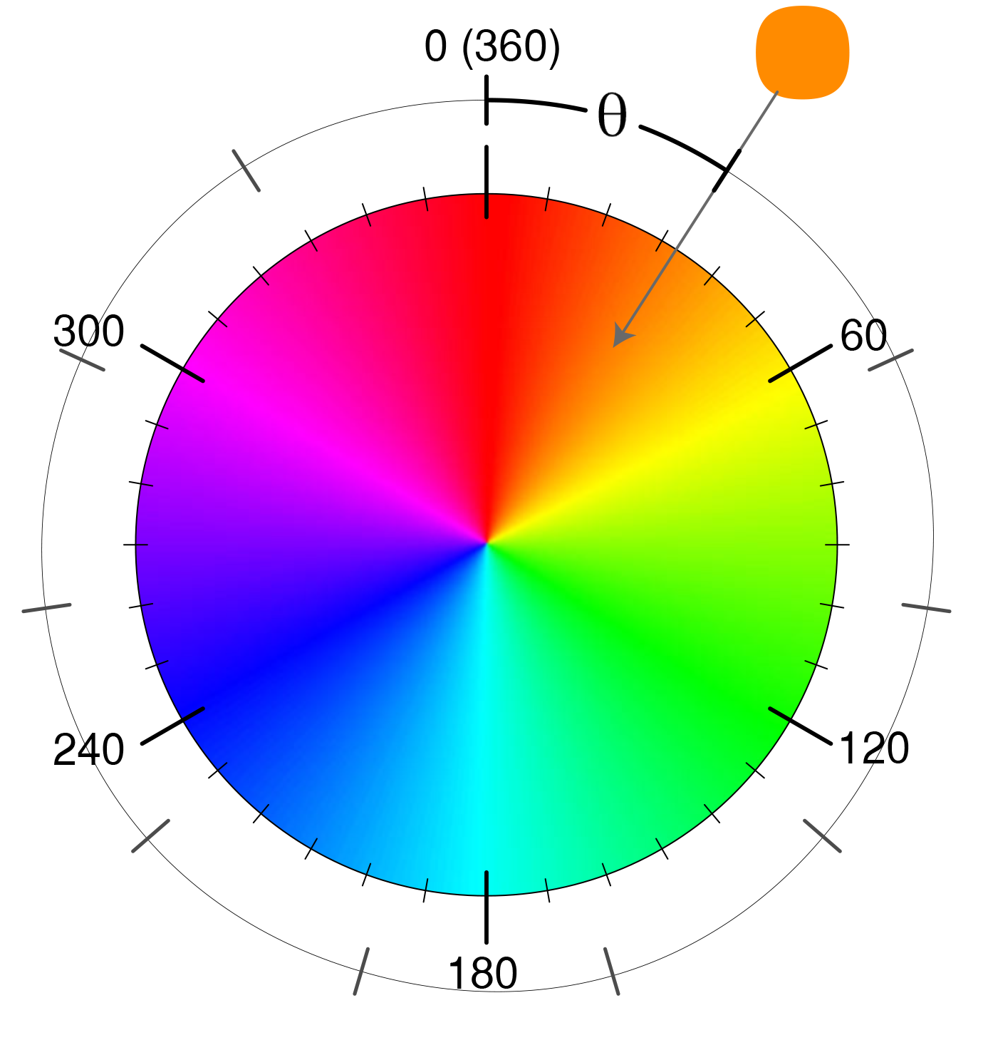
So, to make red the main theme color, just write in the code editor:
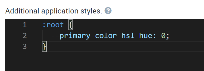
Note
All CSS variables should always be inside the :root section.
--hsl-saturate: - The parameter responsible for color saturation. Reduce this value to make the theme calm and soft. The value --hsl-saturate: 0 will make the theme black and white.
--hsl-light - The parameter which allows changing the degree of the color light. Increase or decrease the value (also in the range from 0% to 100%) to make the colors lighter or darker.