Generation Z
Overview
Generation Z Theme is designed with a focus on UX and UI elements of the young generation, the rising shopping power the next years. The UX and UI effects consider the behavioral patterns of Gen Zers who prefer to swipe and scroll, a simplified navigation to switch between tabs, impressive banners to get a quick path to promotional campaigns, sharing buttons to engage friends with their preferences. The Generation Z Theme got a functionality to remind about the last actions to the visitor. It also offers a handy solution to quickly view the shopping cart. Designers made a provision in the design template to retain wandering minds of new shoppers with a smart arrangement of elements on the storefront.
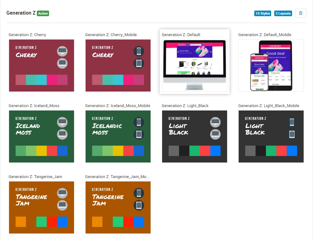
The theme has an option to change color schemes to please the constantly changing next generation tastes. The range of color palettes was selected based on the latest design trends. The theme comes in 5 color schemes (Default, Cherry, Light Black, Iceland Moss, Tangerine Jam), which you can choose depending on your brand and purpose of your store.
The theme is fully responsive and has separate styles that you could choose for mobile version. Your website will display beautifully and intuitively across all devices.
Home page
Product page

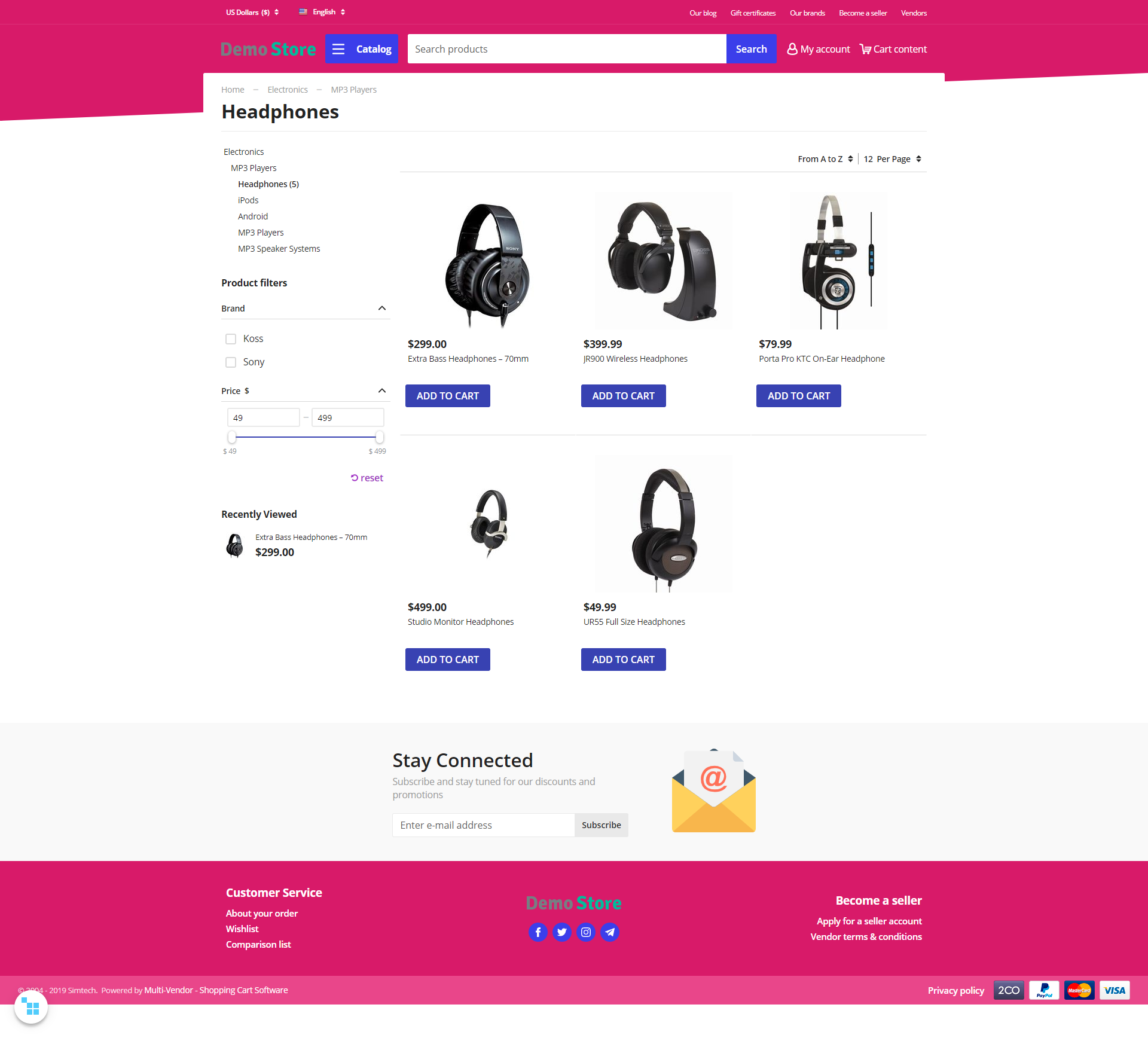
Catalog page
The Generation Z theme comes with Mobile Layouts add-on.
Compatibility
The theme is compatible with Multi-Vendor, Multi-Vendor Plus, Multi-Vendor Ultimate 4.9.0 , 4.10.4 and above.
Don’t know what archive to download to install the add-on? Read here.
Support
This theme is created and published by Simtech Development Ltd., a CS-Cart developer. You are guaranteed a quality theme supported by the future versions. If you need help, please contact us via our help desk system.
Demo store
Check out the Generation Z theme in our demo store.
Note
Every half an hour the demo store is reset to the default state.
Installation and setup
Installing the theme and add-ons
- Go to Addons → Manage add-ons and click the “+” (Upload & install add-on) button and install the Mobile Layouts add-on.
- Click the “+” (Upload & install add-on) button once again and install the Eagle Owl Previewer add-on.
- Go to Addons → Manage add-ons and click the “+” (Upload & install add-on) button and install the Generation Z theme add-on.
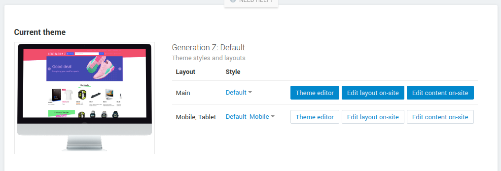
- Go to Design → Themes and activate the theme. Configure styles for layouts.
- Go back to Addons → Manage add-ons and configure Mobile Layouts and Generation Z add-ons.
Setting up the add-ons
Generation Z add-on
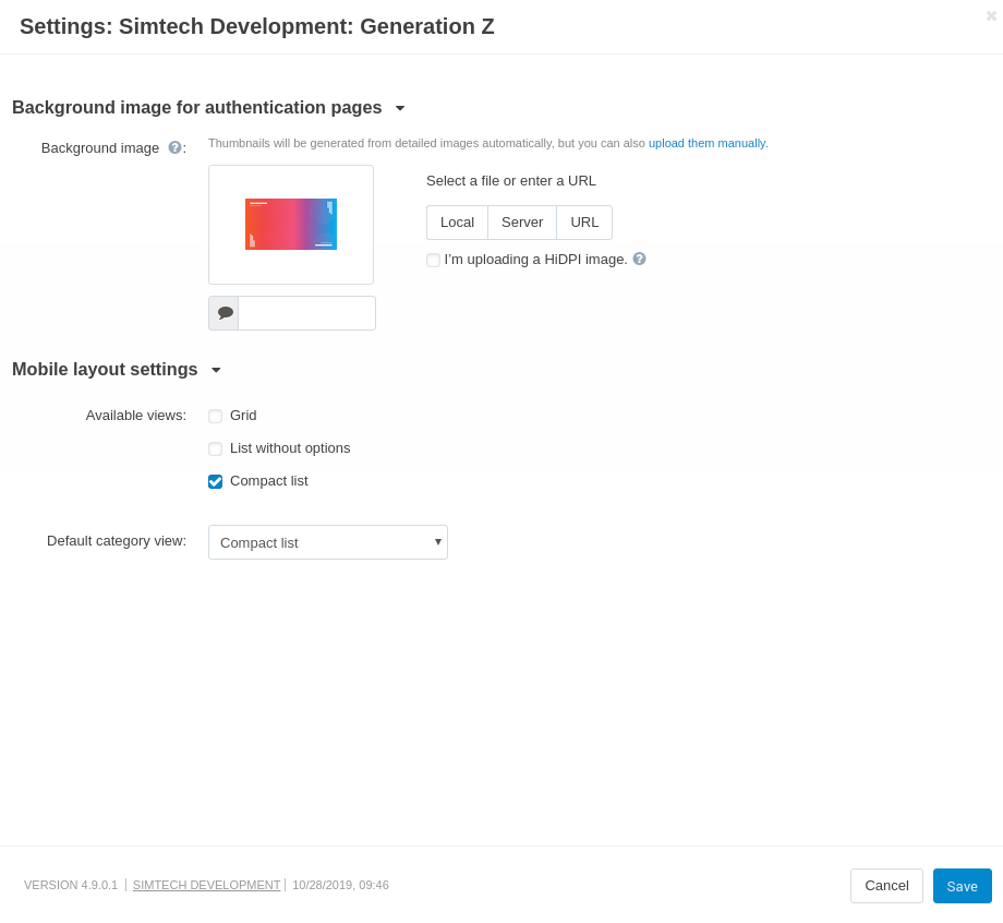
All settings of the “Generation Z” add-on are split into two sections: Background image for authentication pages and Mobile layout settings.
Background image for authentication pages
- Background image for authentication pages - specifies the image that will be displayed as background image on pages Sign in/Register.
Mobile layout settings
- Available views - does the same functionality as the setting “Available product list views” on the page Settings → Appearance in “Products list layouts settings” section for the layouts specified in settings “Layout for mobile phone”, “Layout for tablet” of the “Mobile Layouts” add-on.
- Default category view - does the same functionality as the setting “Product list default view” on the page Settings → Appearance in “Products list layouts settings” section for the layouts specified in settings “Layout for mobile phone”, “Layout for tablet” of the “Mobile Layouts” add-on.
- Open panels by swipe - in mobile version, you can open menu and cart pannels by swipe
Mobile Layouts
Allows you to show different layouts on desktop, mobile, and tablet devices.
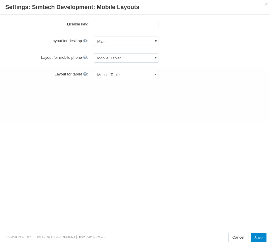
More information about the Mobile Layouts can be found in the user guide.
EagleOwl Previewer
The add-on has a simple set up. Please, follow the guide.
Product Reviews
The theme is adapted to the new CS-Cart add-on “Product reviews”, that extends the functionality of the theme and adds several new useful features.
New features:
- Rating display on the product lists
- Rating and review quantity on the product page header
- New product tab
- New “Rating 4+” filter
Key differences
- Renovated design and interface of the add-on components
- Comfortable rating select in “Write a review” section
- Improved file uploader interface in a “Write a review” section
- Filtration and sorting functions are transferred to the side-bar
- Two options of user’s images display that depend on the images quantity
New settings in Theme editor
Colors
Decorative links - sets the color for custom links.
Decorative button - sets the color for custom buttons.
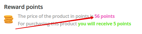
Primary decorative - set the color to attract attention. Applied for: wrapper icons “GNZ: Stylized important block (H2 header)”; header background of Products : GNZ: Drawing attention template; text related to add-on “Reward points”.
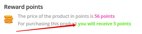
Secondary decorative - set the color to attract attention. Applied for: attractive template Products : GNZ: Drawing attention template; text related to add-on “Reward points”.
- Decorative extra light - the color is applied to strokes, backgrounds, shadows.
- Decorative light - the color is applied to strokes, backgrounds, shadows.
- Decorative dark - the color is applied to strokes, backgrounds, shadows.
- Decorative extra dark - the color is applied to strokes, backgrounds, shadows, secondary text.
- Interaction elements - the color is applied to select box, input, radiobutton form elements; active tabs, active links.
- Rating Icons - the color is applied for coloring ★ icons of “Comments and reviews” add-on.
Theme extensions
Flexbox Grid
Note
All new settings related to grids do not change the appearance of grids in the block manager, they affect only grids displayed on the storefront.
New grids settings:
Wrapper. New values:
- Sticking to parent. A section becomes floating relative to its parent.
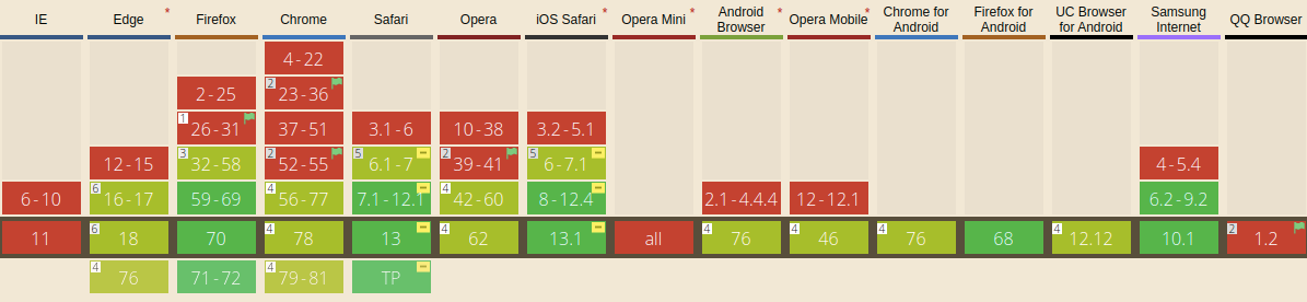
Tip
- The method that was used for this feature is not supported in some browsers. Please, check the table below before using. Don’t use this setting on the layout for mobile devices.
-
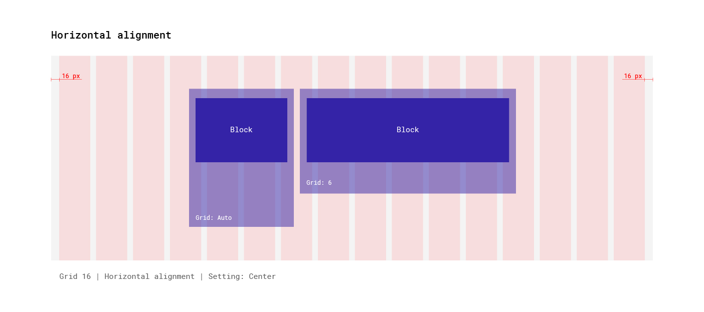
Override width (NONE, Auto, Fill in the empty space). New settings for changing grid width.
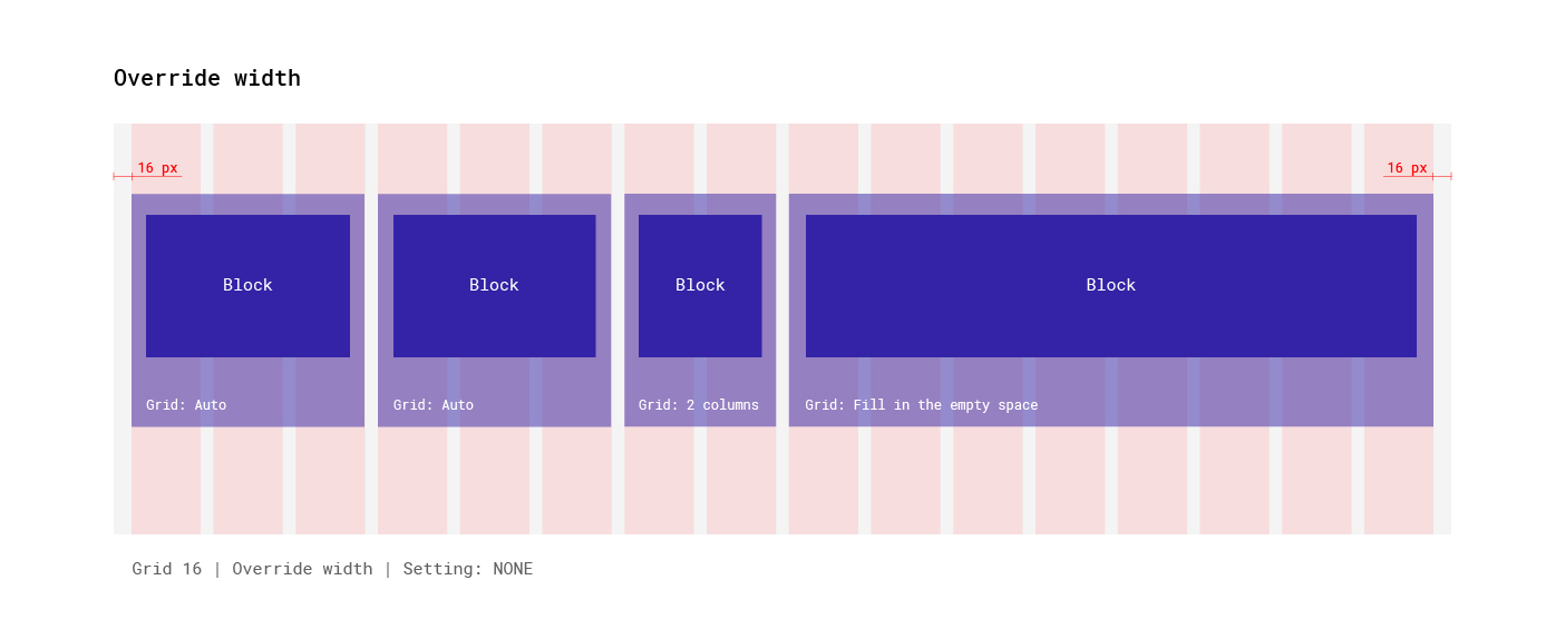
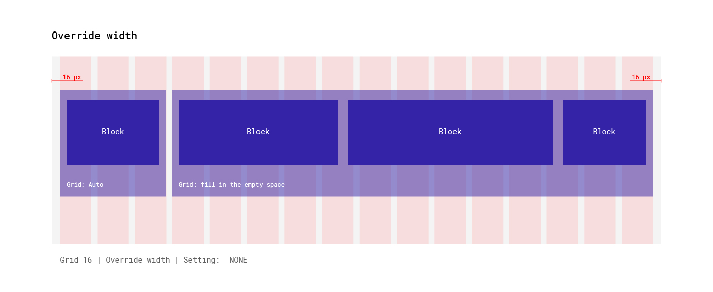
- “None” value - the grid will have a fixed width specified by the Width setting.
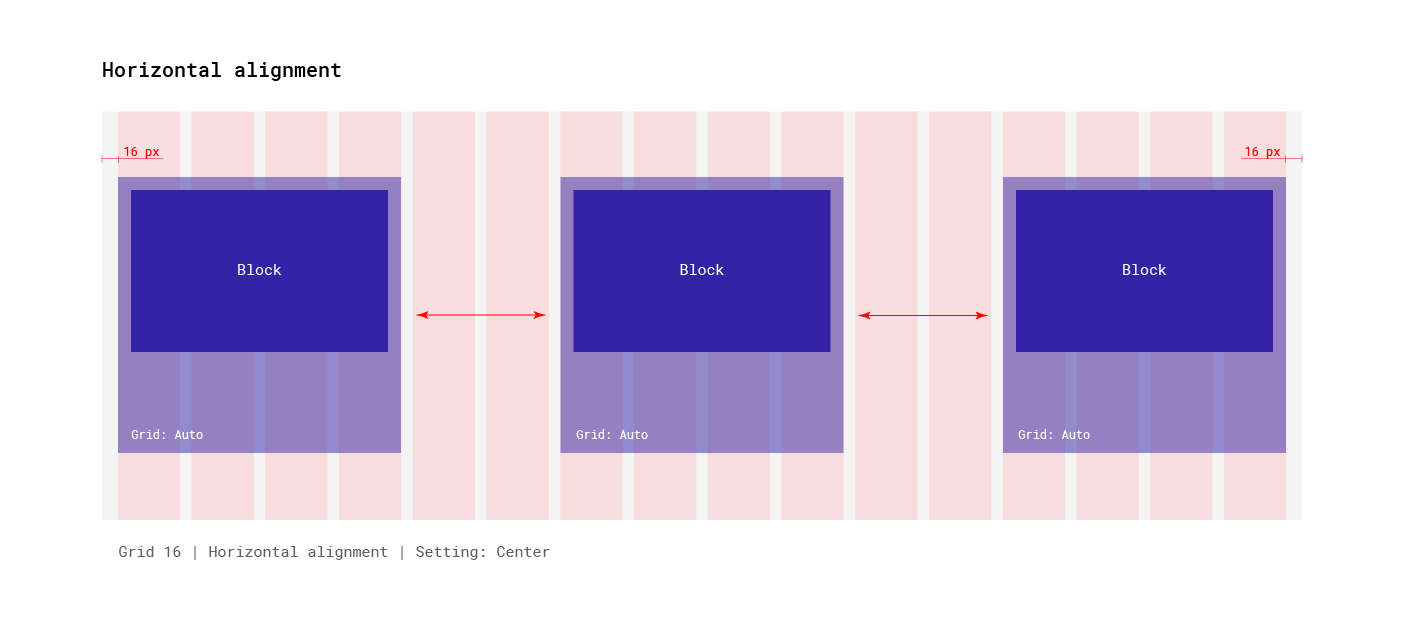
- “Auto” value - the grid width will be defined automatically according to its content.
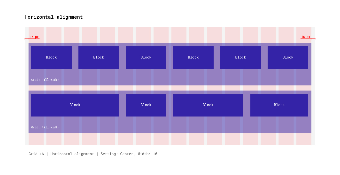
- “Fill in the empty space” value - the grid stretches on the remaining space relative to the parent grid.
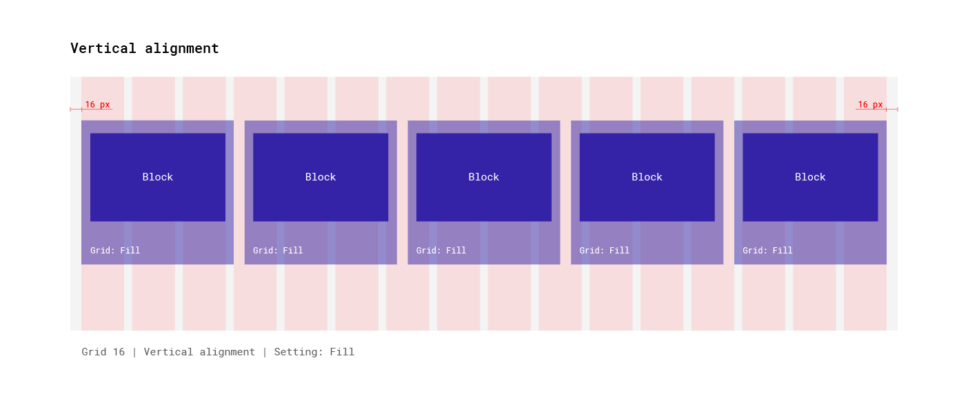
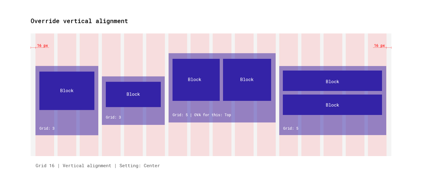
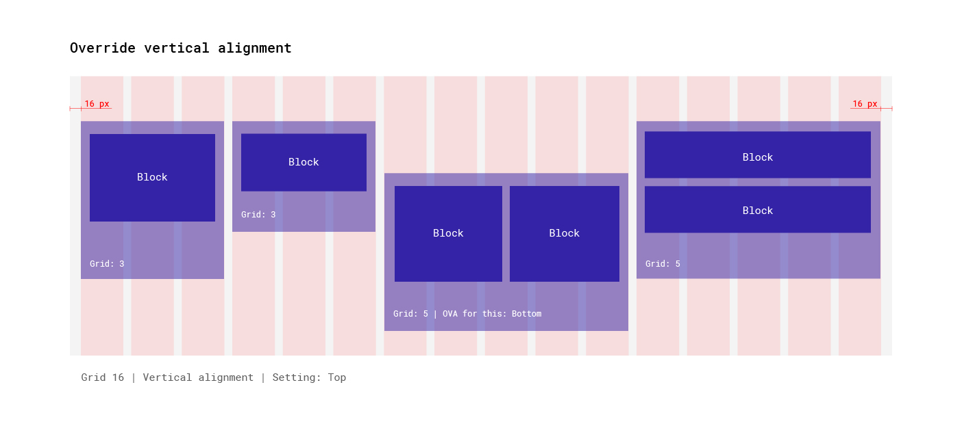
Vertical alignment. Aligns nested sections/blocks vertically.
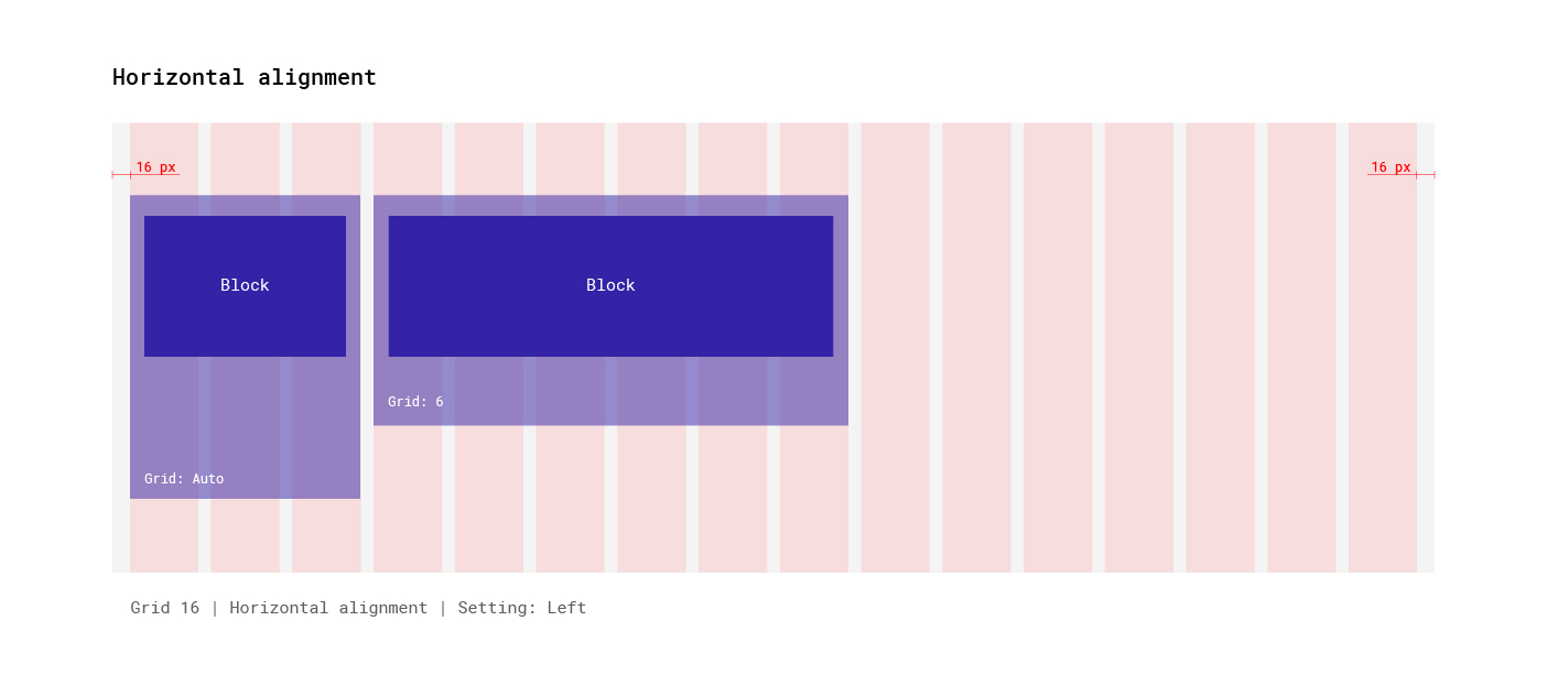
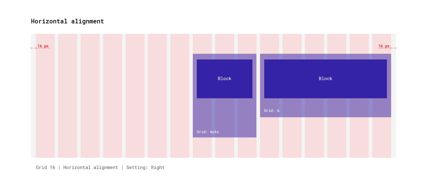
- Horizontal alignment. Aligns nested sections/blocks horizontally.
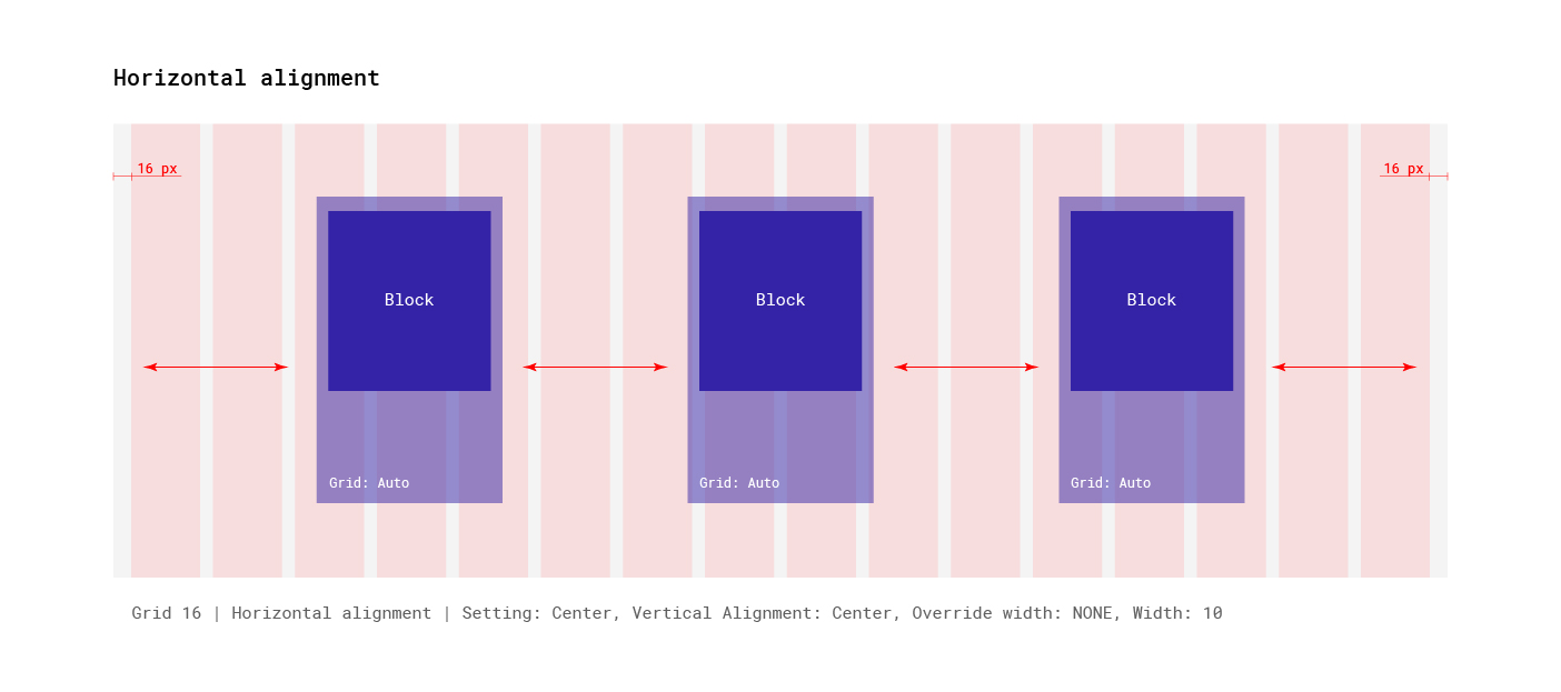
- Override vertical alignment for this. Overrides the vertical alignment of the parent section for the current section.
Notifications
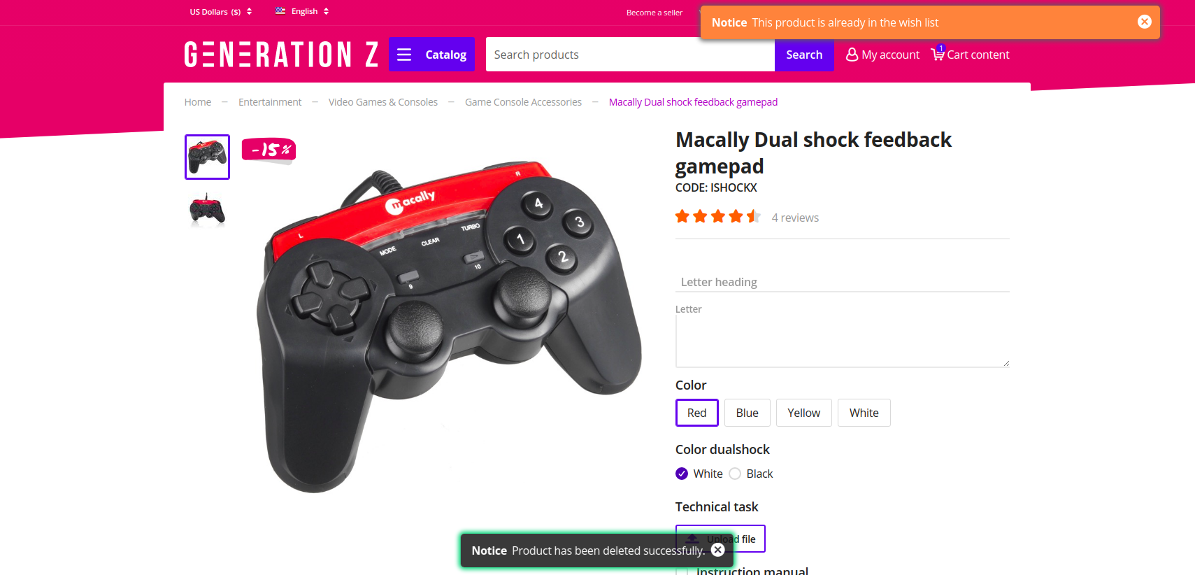
Notifications that close automatically are now displayed in the bottom center and have a dark fill. The other notifications remained in the same place. Animation for appearing and hiding of notification was added.
Promotions
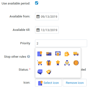
The theme allows to add an icon to the promotion. The range of icons is set by the theme. The block is displayed on the pages “Cart”, “Checkout” and “Order detail page”.
Promotions settings:
The example of promotion on the “Cart” page:
Improvements in existing blocks and templates
Breadcrumbs
The theme allows to replace the last element of the chain with the header H1. It is useful for SEO, easier for the customer to understand on what page he is and the titles of all pages are placed the same way.
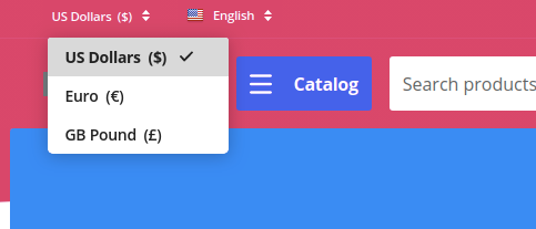
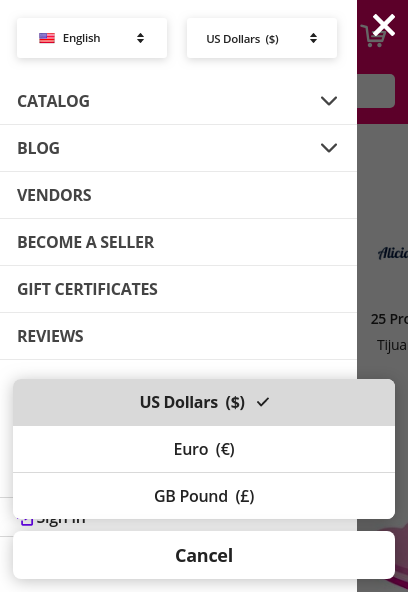
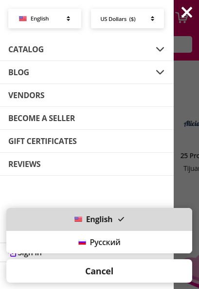
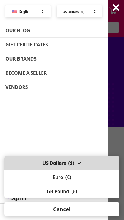
Currencies and languages
Generation Z theme adds animation for the drop-down list. Also you could switch between the drop-down elements from the keyboard. Keys:
- Up - switches focus to the previous item;
- Down - switches focus to the next item;
- Enter - activate;
- Space - activate;
- Esc - close.
Desktop version:
Mobile version:
Template : Search
On mobile layouts, the block differs from the desktop version for increasing usability.
Desktop version:

Mobile version:

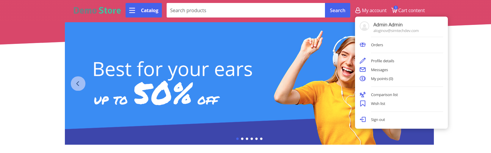
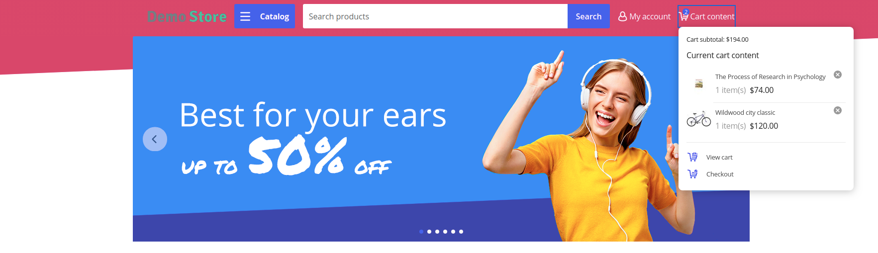
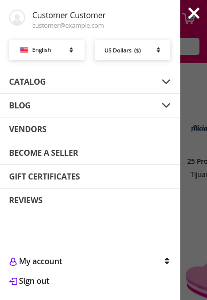
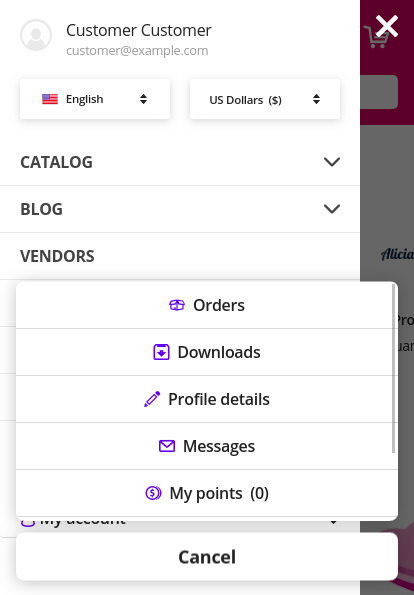
My account, Cart content
Generation Z theme adds new animated wrappers for My account and Cart content blocks. All items in the list have icons, the preliminary cost of the cart is displayed in the drop-down content.
My account:
Cart content:
Banners : Carousel
Generation Z theme allows to display arrows and points together (Setting: Navigation - Dots and arrows).
New blocks, templates and wrappers
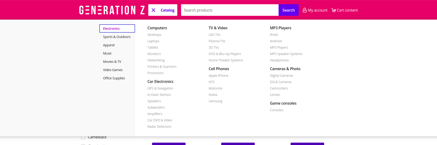
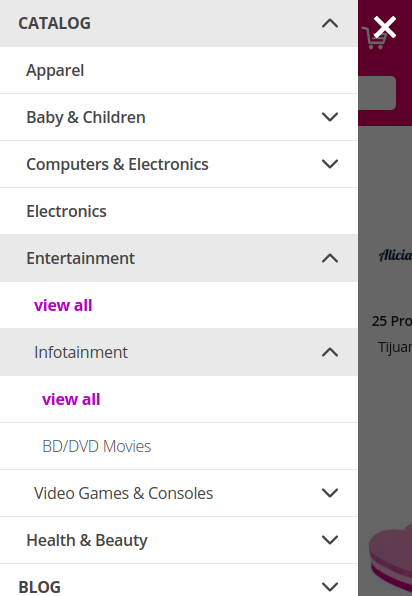
GNZ: Categories block
GNZ: Categories block contains “GNZ: Large list” template and “GNZ: Dropdown onclick” wrapper. Categories of the 1st level are displayed in the left column, 2nd and 3rd level in the right column.
The right column is divided into columns (newspaper columns), the number of columns is set by the template setting Number of columns in the objects list. Keyboard control is available for the template. Keys:
- Up - switches focus to the previous item;
- Down - switches focus to the next item;
- Left - switches focus to the left column;
- Right - switches focus to the right column;
- Enter - activate;
- Space - activate;
- Esc - close.
GNZ: Hamburger menu block
GNZ: Hamburger menu block contains “GNZ: Hamburger” template and 3 wrappers (dropdown list, appearing from left and right sides windows). The block is filled with menu. The menu could be set up on the Design : Menus page. The block has the ability to display profile data, blocks languages and currencies.
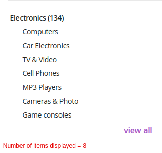
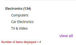
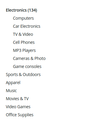
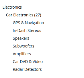
GNZ: Categories : Subcategories block
The block is intended for the category page (categories.view), on the other pages it will not be applied. The block has “GNZ: subcategories tree” template. The template displays:
- Nesting tree for an active category;
- Child categories;
- If there are no child categories, neighboring categories are displayed;
- If the active category is the 1st level category, then both neighboring and child categories are displayed.
The template has the setting “Number of items displayed”, which is responsible for the number of items displayed before clicking on the “View all” button.

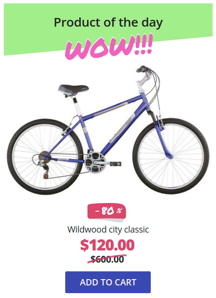
Products : GNZ: Drawing attention template
The template is intended for drawing attention to one product. During a quick page scrolling, the customer will definitely notice this block and check the product.
The template has several settings:
- Accent text - field with text that will be displayed under the heading of the block;
- Show price - setting for showing/hiding the price;
- Thumbnail width in scroller - product image width;
- Scroller icon height - product image height.
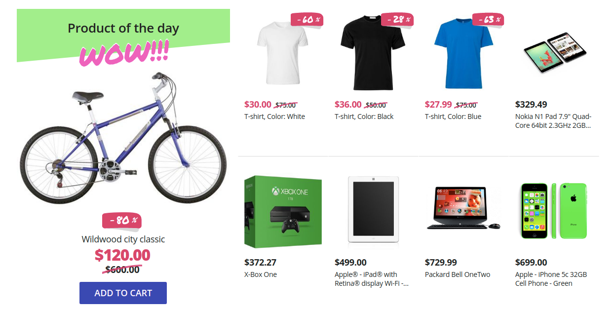
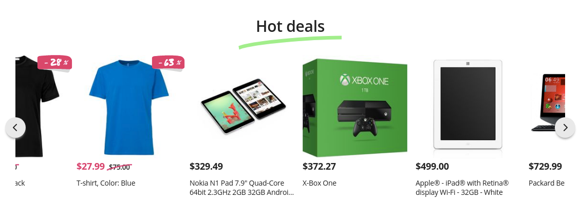
Scroller PRO
The brand new scroller was developed specially for Generation Z theme. This template can be applied to products, vendors and brands blocks.
The main features:
independent - the amount of shown products is floating, the elements’ width is defined automatically;
the elements’ width depends on content (the template setting “Thumbnail width in scroller”);
the template is built on a native scroll, which means that the scroller has the following features:
- horizontal scroll (for example, with a touchpad);
- when switching from the keyboard, the browser will automatically scroll to the focus element;
- scrolls through the native swipe on mobile devices.

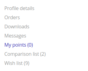
My account : GNZ: My account menu template
The template displays links to profile details, orders, wish list, comparison list, messages (“Vendor communication” add-on is required), my points (“Reward points” add-on is required).
Pages main content
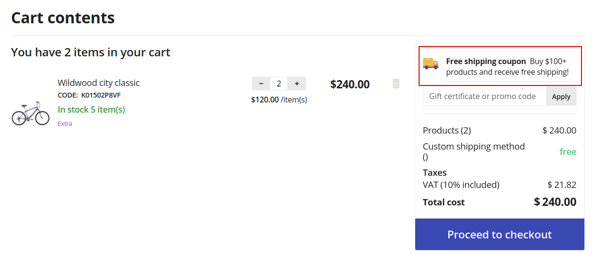
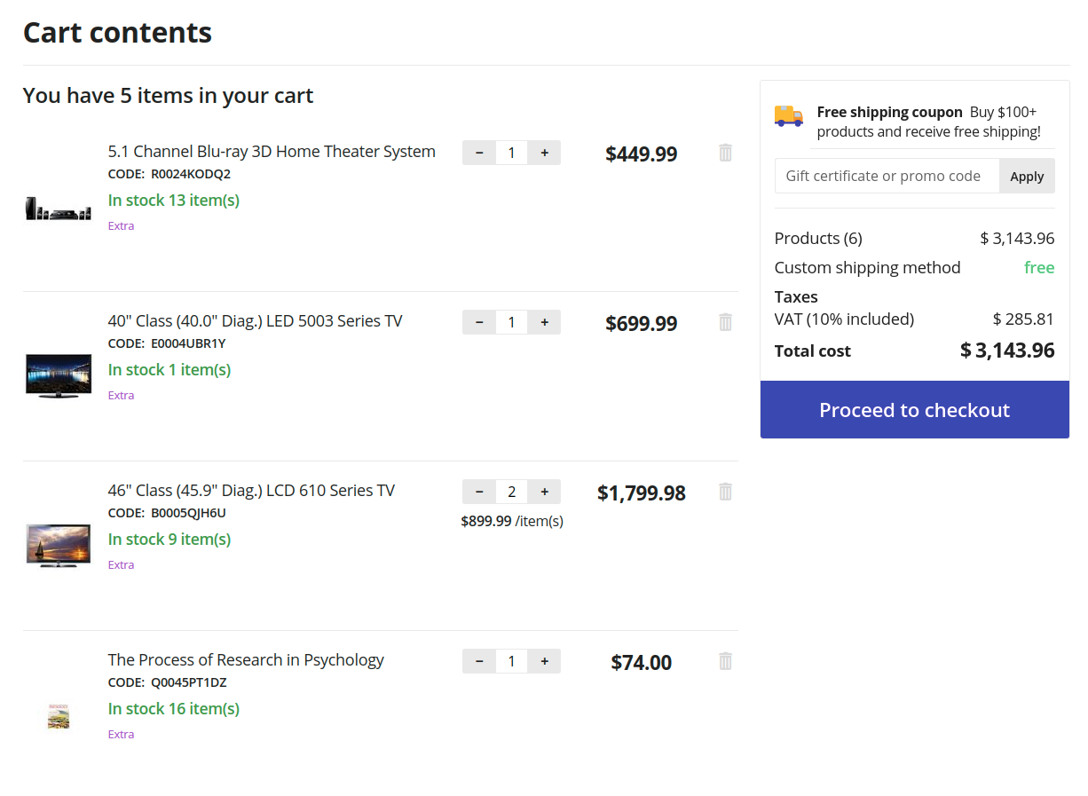
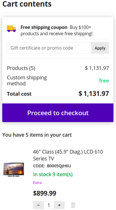
Cart
The page content is divided into 2 parts. The right column is floating, relative to the left one.
- Desktop version:
-
- Mobile version:
-
Checkout
The theme checkout contains improved input fields, new wrappers for checkout blocks and allows to control fields and interactive elements from the keyboard.
Product detail page
For the desktop version, the column with product image is floating. The theme replaces option select boxes with buttons, improves accessibility of interactive elements from the keyboard, trims content for large reviews and replaces the cropped content with [...] button.
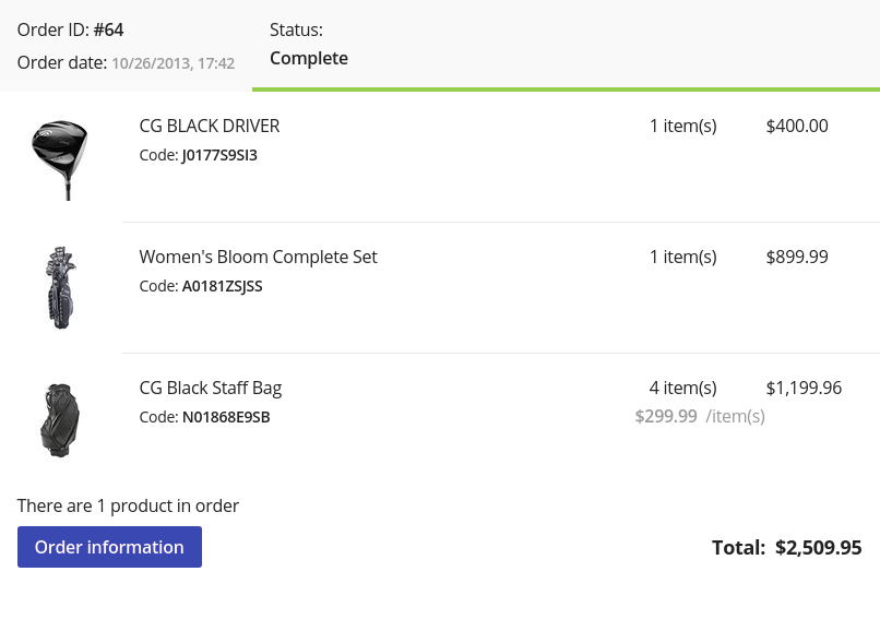
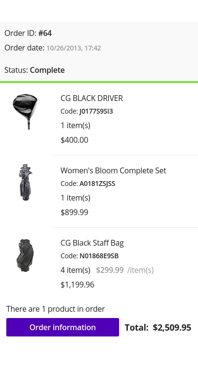
Orders
For the desktop version, block is moved to the right side. The orders table is replaced with blocks and expanded to simplify order searching. For each order the limited content of the order is displayed. Orders sorting placed in select box. You could change the color of the order status on the Administration : Statuses - Order statuses page.
Desktop version:
Mobile version:
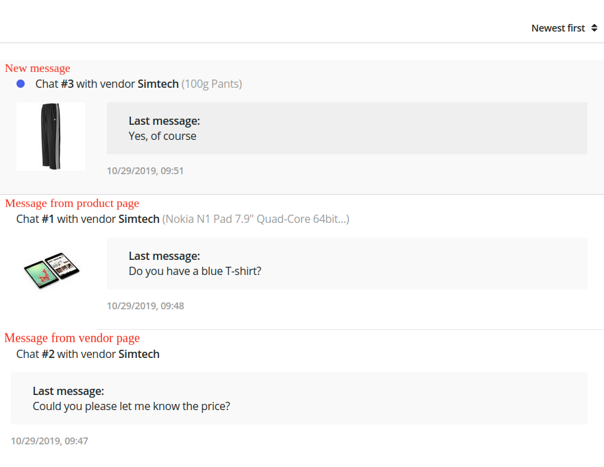
Messages (Add-on: Vendor communication)
Generation Z theme adds expanded dialogue information to dialogue list to simplify the perception of information. If the user started the dialogue from the product page, information about the product and the product image will be specified. The table with dialogue list is replaced with blocks.
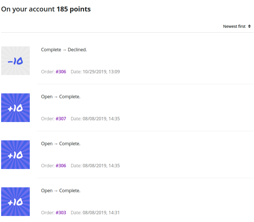
My points (Add-on: Reward points)
Generation Z theme adds a subtitle with information about number of customer points. Sorting placed in select box. The table with dialogue list is replaced with blocks.
Comparison list
Generation Z theme replaces filters with select boxes. The ability of adding to the cart from this page is removed.
Sign in/Register
The theme allows to upload an image for the background. The page will display the content specified through the block manager. The background image can be set in the add-on settings (Generation Z add-on).
Vendors
Generation Z theme replaces the vendors list with Grid-list on the desktop. On the mobile version vendors list is displayed as compact list. The theme trims content for vendor description and replaces the cropped content with [...] button. Vendors sorting placed in select box.
Desktop version:

Mobile version:

User classes
mt-Nx | N = 1 … 20
Specifies the top outer margin on the top, where by default of the theme, the unit of N is 4px.
mr-Nx | N = 1 … 20
Specifies the outer margin on the right, where by default of the theme, the unit of N is 4px.
mb-Nx | N = 1 … 20
Specifies the outer margin below, where by default of the theme, the unit of N is 4px.
ml-Nx | N = 1 … 20
Specifies the outer margin on the left, where by default of the theme, the unit of N is 4px.
content-top-banners
The class is applied for desktop layout and banners placed as the first block in the “Content” container. It sticks banners to the header and to the edges of the layout horizontally.
grid-full-width
The class is applied for mobile layout and in the “Content” container. It stretches the grid over the entire width of the screen, removing the main horizontal indents. This class in the default layout is used for banners on the main page.
tor-footer-top-panel
The class is applied for grids in footer. It paints the background of the element to “Decorative extra light” color (set in the Theme editor on the “Colors” tab).
tor-footer-bottom-panel
The class is applied for grids in footer. It paints the background of the element to slightly lighter color than “Footer - Background color” color (set in the Theme editor on the “Backgrounds” tab).
tor-footer-full-width
The class is applied for grids in footer. It is recommended to use the class only for 16 columns grids (full-width grids). The class replaces the width of the element with the one specified by the layout settings.